Pareto Chart
Overview
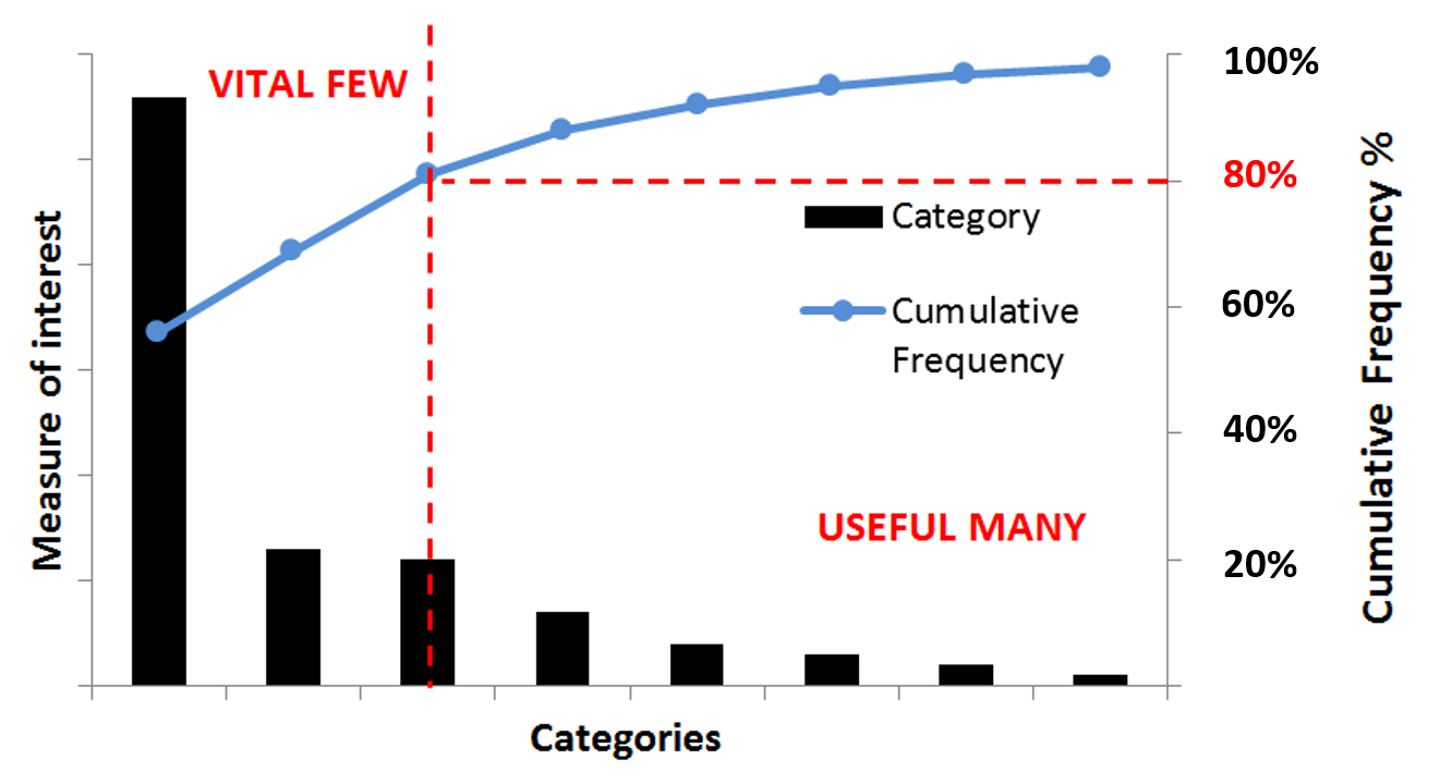
A Pareto chart is essentially a bar chart showing how often different categories of events/incidents take place. The most common is ordered to the left, and the least common is ordered to the right. It also includes a line showing the cumulative frequency (adding each column’s value to the previous ones in turn). A Pareto chart follows the 80/20 principle developed by Vilfredo Pareto, an Italian economist in the early 20th century.
The 80/20 principle asserts that for many events, roughly 80% of the effects come from 20% of the causes. This then allows you to focus on where improvement projects are needed most and will have the biggest impact.
Characteristics of a Pareto chart
- On the X axis you have the area of interest (categories) e.g. as ward names.
- On the left Y axis you have the number of events e.g. number of falls.
- On the right Y axis you have the cumulative frequency.
- Essentially, a Pareto chart is a bar and line graph combined. The bars display the number of events per area of interest whilst the line displays the cumulative % of events.
- Categories contributing to 80% of the problems are often referred to as the ‘vital few’ whereas the others are labelled the ‘useful many’.
Key points about a Pareto chart
- They work best with 30 observations across the categories. Smalls numbers of data can be misleading due to random change.
- The classification by categories is only a guide to where to focus attention of your improvement project.
- Identifying categories where 80% of the problems are occurring is not the only thing to consider when deciding where to focus improvement efforts.
- Pareto charts don’t explain what sort of variation is being observed. To distinguish random (common cause) and non-random (special cause) variation you need to use either a run chart or control charts.
The Science of Improvement on a Whiteboard with Robert Lloyd, Vice President, Institute for Healthcare Improvement
Learn how to create an Pareto chart using Microsoft Excel
Follow QI on social media
To keep up to date on the latest concerning QI at ELFT, follow us on our socials.


