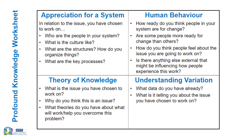
Understanding the problem
- Overview
- Gathering Information
- Flow Diagrams
- Pareto Chart
- Frequency Plots
- Scatter Plot
- Cause and Effect Diagram (Fish Bone)
- Tree Diagram
- Matrix Diagram
- Three Part Data Review
Share this:
Gathering Information
Data Collection Plan Template Overview:
This template documents who will collect what data, when and how for each improvement measure.
How to use it
This template can be used to describe details for data that will be collected for each measure proposed for an improvement project:
- Who will collect data?
- What data will they collect? Are these data attributes (yes/no, categories) or variables? (measured numerical data such as height, weight, time taken)
- Where will they collect the data?
- When will they collect the data? (frequency (daily, weekly, monthly) and if part of existing process at what step?)
- How will the data be recorded? Is there an existing source? (be specific)
- Will we count every event or take a sample? If sampling how will we choose the sample?
- What are the stratifiers? (if any) (stratifiers are subdivisions of data that reflect known differences in the process (for example by diagnostic group, day v night shift)
- What analytical tools do we plan to use?
- How will data be presented? What types of tables and charts?
- Who will do the analyses and create the charts? (Same person for both activities?)
- Who will receive the results? How often will they receive them?
What next?
The data collection plan template can be downloaded here.
This is useful for sharing just this resource rather than the whole collection
Flow Diagrams
Creating Flow Diagrams and Process Mapping is used to develop a ‘map’ of a process within a system. It will help you to map the whole patient journey or diagnostic pathway with a range of people who represent the different roles involved. Process mapping can be used to help a team understand where the problems are and identify areas for improvement.
How to use it
The aim of process mapping is to make things clear and to provide insight. The best map is often the simplest map.
There are different approaches to process mapping. Which one you select will depend upon what you need to know, what level you are working at (whole pathway or a small part of it), resources available and timescales.
Start with a high level process map of say 5 to 10 steps which you set a time limit to achieve e.g. 20 minutes. This helps to establish the scope of the process and identify significant issues. Here is a simple example of a high level process map.
Key to process mapping
Box | Shows the activities of the process. |
Diamond | Represents the stage in the process where a question is asked or a decision is required. |
Oval | Shows the start of a process and the inputs required. Also used to mark the end of the process with the results or outputs. The symbol is the same for the start and end of a process to emphasis interdependency. |
Arrows | Show the direction or flow of the process. |
There is software that can help you to develop process maps but in a group setting you can use rolls of paper (lining paper from a DIY store); marker pens, post-it notes in different colours to represent the four different symbols, flip chart to ‘park’ issues and display ground rules for your session.
Once you have your high level process map you will start to be able to understand how the process works and where there are problems, drilling down into these with more detailed process maps. Further work maybe required to analyse the problem areas identified e.g. seek stakeholder feedback or further data collection. The information and level of detail required will depend on the scope of your project. The Aims Tool and the Driver Diagram may be useful tools to help you clarify this.
Scope
- What do you need to know?
- How simple can you go?
- Are you working at a high-level or focusing in more detail?
Knowing whose views you will need to inform the improvement is important. You should consider:
- Whose views do you need?
- How will you engage those individuals?
- How will you capture their views?
Ideally you will know what your problem areas such as the point in your process where a constraint causes flow to be slowed. This may already have been identified right at the start of the improvement journey when developing your project charter.
The Science of Improvement on a Whiteboard with Robert Lloyd, Vice President, Institute for Healthcare Improvement
This is useful for sharing just this resource rather than the whole collection
Pareto Chart
Overview
A Pareto chart is essentially a bar chart showing how often different categories of events/incidents take place. The most common is ordered to the left, and the least common is ordered to the right. It also includes a line showing the cumulative frequency (adding each column’s value to the previous ones in turn). A Pareto chart follows the 80/20 principle developed by Vilfredo Pareto, an Italian economist in the early 20th century.
The 80/20 principle asserts that for many events, roughly 80% of the effects come from 20% of the causes. This then allows you to focus on where improvement projects are needed most and will have the biggest impact.
Characteristics of a Pareto chart
- On the X axis you have the area of interest (categories) e.g. as ward names.
- On the left Y axis you have the number of events e.g. number of falls.
- On the right Y axis you have the cumulative frequency.
- Essentially, a Pareto chart is a bar and line graph combined. The bars display the number of events per area of interest whilst the line displays the cumulative % of events.
- Categories contributing to 80% of the problems are often referred to as the ‘vital few’ whereas the others are labelled the ‘useful many’.
Key points about a Pareto chart
- They work best with 30 observations across the categories. Smalls numbers of data can be misleading due to random change.
- The classification by categories is only a guide to where to focus attention of your improvement project.
- Identifying categories where 80% of the problems are occurring is not the only thing to consider when deciding where to focus improvement efforts.
- Pareto charts don’t explain what sort of variation is being observed. To distinguish random (common cause) and non-random (special cause) variation you need to use either a run chart or control charts.
The Science of Improvement on a Whiteboard with Robert Lloyd, Vice President, Institute for Healthcare Improvement
Learn how to create an Pareto chart using Microsoft Excel
This is useful for sharing just this resource rather than the whole collection
Frequency Plots
Frequency Plots: histogram, bar chart and dot plot
Overview
A frequency plot is a graph that shows the pattern in a set of data by plotting how often particular values of a measure occur.
How to use it
Frequency plots are useful to investigate the spread of continuous data and whether it clusters or forms a particular shape (for example the familiar normal (bell-shaped) curve, or alternatively has two peaks).
The horizontal axis of a frequency plot graph shows groupings (say age bands of 0-5, 6 to 10, 11 to 15 etc) of a continuous measure (e.g. age, time, weight, temperature) while the vertical axis shows the number of times that a value in that group was seen.
If a graph uses vertical bars for each grouping of a continuous measure it is described as a histogram. We only use the term histogram when plotting continuous data (measured using an interval scale) or activity data. It does not make sense to rearrange the bars of a histogram because they represent groupings on a continuous scale.
For mutually-exclusive categories we use a closely-related graph – a bar chart. Similar to a histogram, the categories (rather than groupings of a continuous measure) are marked along the horizontal axis, and how often an event in that category occurs determines the height of the bar. On a bar chart the order of the vertical bars can be rearranged because each is an independent category.
When the categories are ordered by frequency the bar chart is called a Pareto chart. Pareto charts are particularly useful in determining where to concentrate improvement efforts (see separate tool page).
If a graph uses dots to show each observation within a grouping or category then it is described as a dot plot. Dot plots can be used in place of both histograms and bar charts. Dot plots are most suitable for situations where there are only a few options on the horizontal axis and not too many occurrences of each grouping or option.
Example of a Histogram
Example of a Dot Plot
Frequency plots should generally be constructed using thirty or more data points. They can be misleading, however, if values from stable (only random variation observed) and unstable (showing non-random or special cause variation) phases of a process are brought together. It is therefore useful to construct a time-series (runor control chart) first.
Separate frequency plots for time periods with a stable process and where the process is unstable can then be produced. This can be very helpful in understanding what might be going on differently between the two phases.
If there are obvious stratifiers (factors we already know cause differences in care processes or outcomes; for example, day v night or week v week-end) it is good to separate the contributions when plotting. You could use different colours in a stacked bar (or different symbols in a dotplot). Alternatively side-by-side separate graphs (with same scale on axes) can be easier to understand.
What next?
Detailed instructions on how to construct a histogram are available at the IHI website. In Excel both histograms and bar charts can be drawn using the column chart type of graph. Making dot plots in Excel is not very straightforward but this tutorial shows how it can be done. More details on Pareto charts are available here (as a separate tool).
http://www.qihub.scot.nhs.uk/knowledge-centre/quality-improvement-tools/frequency-plots.aspx
This is useful for sharing just this resource rather than the whole collection
Scatter Plot
Overview
A scatter plot is a graph used to look for relationships between two variables
How to use it
Scatter plots show the relationship between the two variables in pairs of observations. One variable is plotted on the horizontal axis (usually the one that you are trying to control) and the other on the vertical axis (usually the one you expect to respond to the changes you are making).
If the vertical variable increases as the horizontal one does (as the example above shows) then we say there is a positive correlation. This may indicate cause and effect but it may not be that simple. If the vertical variable decreases as the horizontal one increases we say there is negative correlation. This may also suggest a cause and effect relationship for further investigation. If the dots are scattered all over the graph then there is no evidence for a relationship between the variables.
As with Pareto charts and frequency plots, separate scatter plots can helpfully be used to understand the difference between time periods with only random (common cause) variation and those with non-random (special cause) variation (identified using Shewhart control charts). Combining those time periods in a single scatter diagram may make interpretation more difficult.
Examples of scatter plots
The below charts show different relationships between variables, strong positive, strong negative
This is useful for sharing just this resource rather than the whole collection
Cause and Effect Diagram (Fish Bone)
What is it and how can it help me?
Cause and effect analysis helps you to think through the causes of a problem thoroughly, including its possible root causes. It is only by identifying the main causes that you can permanently remove the problem, or reduce the delay.
A cause and effect diagram is a tool that helps you do this. The ‘effect’ is the problem you are working on, for example ‘waiting time’. The tool can help you identify major causes and indicate the most fruitful areas for further investigation. It will help you understand the problem more clearly.
By going through the process of building the diagram with colleagues, everybody gains insights into the problem, alongside possible solutions. The people involved benefit from shared contributions, leading to a common understanding of the problem.
The cause and effect diagram is sometimes called a fishbone diagram (because the diagram looks like the skeleton of a fish) or an Ishikawa diagram (after its inventor, Professor Kaoru Ishikawa of Tokyo University).
When does it work best?
The tool quickly helps you to fully understand an issue and to identify all the possible causes – not just the obvious. If you know the cause of the delay, you are then better placed to implement the solution.
- What does it do?
Enables a team to focus on the content of the problem rather than its history or the differing interests of team members - Creates a snapshot of the collective knowledge and consensus of a team around a problem
- Focuses the team on the root cause of the problem – not its symptoms
How to use it
Firstly, identify the problem. Write it in a box and draw an arrow pointing towards it. Think about the exact problem in detail. Where appropriate, identify who is involved, what the problem is, and when and where it occurs.
Example:
Identify the major factors and draw four or more branches off the large arrow to represent main categories of potential causes. Categories could include: equipment, environment, procedures, and people. Make sure that the categories you use are relevant to your particular problem / delay. An alternative way of creating the branches of a cause and effect diagram is to carry out the Affinity Diagram technique and use the group headings produced there.
For Example:
- Take each of the main categories and brainstorm possible causes of the problem. Then, explore each one to identify more specific ’causes of causes’. Continue branching off until every possible cause has been identified. Where a cause is complex, you might break it down into sub-causes. Show these as lines coming off each cause line.
- Analyse your diagram. By this stage you should have a diagram showing all the possible causes of your delay / problem. Depending on the complexity and importance of the problem, you can now investigate the most likely causes further. This may involve setting up interviews (see getting patient perspectives), carrying out process mapping or surveys which you can use to decide whether the causes identified are correct.
Tips:
- Make sure that your team agree on the problem statement. Include as much information as possible in the ‘what’, ‘where’, ‘when’ and ‘how much’ of the problem. Use data to specify the problem if possible
- Aim to construct the diagram with the people involved in the problem
- You can use a cause and effect diagram as a working document that is updated as and when you collect more data, or to trial various solutions
- Use a paper surface so that you can transport the final diagram
- Ideally, causes should appear in only one category, although some people causes may overlap
Please click here to download a template for you to use yourself
More examples
Background
The cause and effect diagram was adopted by Dr W Edwards Deming as a helpful tool for improving quality. Dr Deming has been teaching total quality management in Japan since World War II. He has also helped develop statistical tools used for the census, and has taught methods of quality management to the military. Both Ishikawa and Deming use this diagram as one the first tools in the quality management process.
Acknowledgements / sources
TIN, now the East Midlands Improvement Network and Dave Young.
© Copyright NHS Institute for Innovation and Improvement 2008
Found this page useful?
Sign up to the ELFT QI Newsletter to get QI news, stories and updates straight to your inbox
This is useful for sharing just this resource rather than the whole collection
Tree Diagram
It is used to break down broad categories into finer and finer levels of detail. Developing the tree diagram helps you move your thinking step by step from generalities to specifics.
When to Use a Tree Diagram
- When an issue is known or being addressed in broad generalities and you must move to specific details, such as when developing logical steps to achieve an objective.
- When developing actions to carry out a solution or other plan.
- When analyzing processes in detail.
- When probing for the root cause of a problem.
- When evaluating implementation issues for several potential solutions.
- After an affinity diagram or relations diagram has uncovered key issues.
- As a communication tool, to explain details to others.
Tree Diagram Procedure
- Develop a statement of the goal, project, plan, problem or whatever is being studied. Write it at the top (for a vertical tree) or far left (for a horizontal tree) of your work surface.
- Ask a question that will lead you to the next level of detail. For example:
- For a goal, action plan or work breakdown structure: “What tasks must be done to accomplish this?” or “How can this be accomplished?”
- For root–cause analysis: “What causes this?” or “Why does this happen?”
- For gozinto chart: “What are the components?” (Gozinto literally comes from the phrase “What goes into it?”
Brainstorm all possible answers. If an affinity diagram or relationship diagram has been done previously, ideas may be taken from there. Write each idea in a line below (for a vertical tree) or to the right of (for a horizontal tree) the first statement. Show links between the tiers with arrows.
- Do a “necessary and sufficient” check. Are all the items at this level necessary for the one on the level above? If all the items at this level were present or accomplished, would they be sufficient for the one on the level above?
- Each of the new idea statements now becomes the subject: a goal, objective or problem statement. For each one, ask the question again to uncover the next level of detail. Create another tier of statements and show the relationships to the previous tier of ideas with arrows. Do a “necessary and sufficient check” for each set of items.
- Continue to turn each new idea into a subject statement and ask the question. Do not stop until you reach fundamental elements: specific actions that can be carried out, components that are not divisible, root causes.
- Do a “necessary and sufficient” check of the entire diagram. Are all the items necessary for the objective? If all the items were present or accomplished, would they be sufficient for the objective?
Tree Diagram Example
The Pearl River, NY School District, a 2001 recipient of the Malcolm Baldrige National Quality Award, uses a tree diagram to communicate how district-wide goals are translated into sub-goals and individual projects. They call this connected approach “The Golden Thread.”
The district has three fundamental goals. The first, to improve academic performance, is partly shown in the figure below. District leaders have identified two strategic objectives that, when accomplished, will lead to improved academic performance: academic achievement and college admissions.
Tree Diagram Example
Lag indicators are long-term and results–oriented. The lag indicator for academic achievement is Regents’ diploma rate: the percent of students receiving a state diploma by passing eight Regents’ exams.
Lead indicators are short-term and process-oriented. Starting in 2000, the lead indicator for the Regents’ diploma rate was performance on new fourth and eighth grade state tests.
Finally, annual projects are defined, based on cause–and–effect analysis, that will improve performance. In 2000–2001, four projects were accomplished to improve academic achievement. Thus this tree diagram is an interlocking series of goals and indicators, tracing the causes of systemwide academic performance first through high school diploma rates, then through lower grade performance, and back to specific improvement projects.
Excerpted from Nancy R. Tague’s The Quality Toolbox, Second Edition, ASQ Quality Press, 2004, pages.
http://asq.org/learn-about-quality/new-management-planning-tools/overview/tree-diagram.html
This is useful for sharing just this resource rather than the whole collection
Matrix Diagram
Six differently shaped matrices are possible: L, T, Y, X, C and roof–shaped, depending on how many groups must be compared.
When to Use Each Matrix Diagram Shape
Table 1 summarizes when to use each type of matrix. Also click on the links below to see an example of each type. In the examples, matrix axes have been shaded to emphasize the letter that gives each matrix its name.
- An L–shaped matrix relates two groups of items to each other (or one group to itself).
- A T–shaped matrix relates three groups of items: groups B and C are each related to A. Groups B and C are not related to each other.
- A Y–shaped matrix relates three groups of items. Each group is related to the other two in a circular fashion.
- A C–shaped matrix relates three groups of items all together simultaneously, in 3-D.
- An X–shaped matrix relates four groups of items. Each group is related to two others in a circular fashion.
- A roof–shaped matrix relates one group of items to itself. It is usually used along with an L – or T–shaped matrix.
Table 1: When to use differently-shaped matrices
L-shaped |
2 groups |
A B (or A A) |
T-shaped |
3 groups |
B A C but not B C |
Y-shaped |
3 groups |
A B C A |
C-shaped |
3 groups |
All three simultaneously (3-D) |
X-shaped |
4 groups |
A B C D A but not A C or B D |
Roof-shaped |
1 group |
A A when also A B in L or T |
L-Shaped Matrix Diagram
This L-shaped matrix summarizes customers’ requirements. The team placed numbers in the boxes to show numerical specifications and used check marks to show choice of packaging. The L-shaped matrix actually forms an upside-down L. This is the most basic and most common matrix format.
Customer Requirements
Customer
D |
Customer
M |
Customer
R |
Customer
T |
|
Purity %
|
> 99.2
|
> 99.2
|
> 99.4
|
> 99.0
|
Trace metals (ppm)
|
< 5
|
—
|
< 10
|
< 25
|
Water (ppm)
|
< 10
|
< 5
|
< 10
|
—
|
Viscosity (cp)
|
20-35
|
20-30
|
10-50
|
15-35
|
Color
|
< 10
|
< 10
|
< 15
|
< 10
|
Drum
|
||||
Truck
|
||||
Railcar |
T-Shaped Matrix Diagram
This T-shaped matrix relates product models (group A) to their manufacturing locations (group B) and to their customers (group C).
Examining the matrix in different ways reveals different information. For example, concentrating on model A, we see that it is produced in large volume at the Texas plant and in small volume at the Alabama plant. Time Inc. is the major customer for model A, while Arlo Co. buys a small amount. If we choose to focus on the customer rows, we learn that only one customer, Arlo, buys all four models. Zig buys just one. Time makes large purchases of A and D, while Lyle is a relatively minor customer.
Products—Customers—Manufacturing Locations
Y-Shaped Matrix Diagram
This Y-shaped matrix shows the relationships between customer requirements, internal process metrics and the departments involved. Symbols show the strength of the relationships: primary relationships, such as the manufacturing department’s responsibility for production capacity; secondary relationships, such as the link between product availability and inventory levels; minor relationships, such as the distribution department’s responsibility for order lead time; and no relationship, such as between the purchasing department and on-time delivery.
The matrix tells an interesting story about on-time delivery. The distribution department is assigned primary responsibility for that customer requirement. The two metrics most strongly related to on-time delivery are inventory levels and order lead time. Of the two, distribution has only a weak relationship with order lead time and none with inventory levels. Perhaps the responsibility for on-time delivery needs to be reconsidered. Based on the matrix, where would you put responsibility for on-time delivery?
Responsibilities for Performance to Customer Requirements
C-Shaped Matrix Diagram
Think of C meaning “cube.” Because this matrix is three-dimensional, it is difficult to draw and infrequently used. If it is important to compare three groups simultaneously, consider using a three-dimensional model or computer software that can provide a clear visual image.
This figure shows one point on a C-shaped matrix relating products, customers and manufacturing locations. Zig Company’s model B is made at the Mississippi plant.
X-Shaped Matrix Diagram
This figure extends the T-shaped matrix example into an X-shaped matrix by including the relationships of freight lines with the manufacturing sites they serve and the customers who use them. Each axis of the matrix is related to the two adjacent ones, but not to the one across. Thus, the product models are related to the plant sites and to the customers, but not to the freight lines.
A lot of information can be contained in an X-shaped matrix. In this one, we can observe that Red Lines and Zip Inc., which seem to be minor carriers based on volume, are the only carriers that serve Lyle Co. Lyle doesn’t buy much, but it and Arlo are the only customers for model C. Model D is made at three locations, while the other models are made at two. What other observations can you make?
Manufacturing Sites—Products—Customers—Freight Lines
Roof-Shaped Matrix Diagram
The roof-shaped matrix is used with an L- or T-shaped matrix to show one group of items relating to itself. It is most commonly used with a house of quality, where it forms the “roof” of the “house.” In the figure below, the customer requirements are related to one another. For example, a strong relationship links color and trace metals, while viscosity is unrelated to any of the other requirements.
Frequently Used Matrix Diagram Symbols
Excerpted from Nancy R. Tague’s The Quality Toolbox, Second Edition, ASQ Quality Press, 2004, pages 338-344.
http://asq.org/learn-about-quality/new-management-planning-tools/overview/matrix-diagram.html
This is useful for sharing just this resource rather than the whole collection
Three Part Data Review
Triple Aim: How to undertake the 3 part data review. Please click on the image to open document.
This is useful for sharing just this resource rather than the whole collection