
Leveraging Microsoft PowerBI to bring our departmental data to life
15th September 2020
By Akkash Purani, Senior Improvement Data Analyst.
The QI department have changed their yearly objectives (April-March) to 90-day objectives, allowing them to be more reactive and flexible during the COVID-19 pandemic. This approach is to strengthen data collection and analysis so that the team can understand and analyse their work during the initial stages of lockdown.
The departmental strategy displayed here in a driver diagram was the starting point (Figure 1). The team collaborated to develop the operational plan and objectives. While these are important pieces to the puzzle, here this story focuses on how a measurement plan was created for each of these objectives, and how Microsoft Power BI was used to visualise these.
Figure.1 – Q2 Department Strategy
Creating a measurement plan
Once the main objectives (the primary drivers in Figure 1) were finalised, key activities and measures which would support the reporting of these activities were identified. These became the details of the operational plan. To do this, part of the recent departmental away day was used where the team was split into two groups to think about how to operationalise the four main objectives. As two of the four objectives were continued from the previous 90-day objectives, more focus was placed on the two new objectives. Being agile and changing objectives after 90 days is one of the benefits to this plan compared to yearly objectives, which are harder to change as time goes on. This activity provoked good discussion and time was well spent discussing potential measures and activities after the away day.
After the leadership team reviewed and finalised the measures, the following steps were taken and added to the measurement plan:
- Operational definitions for each measure were added
- A data collection plan – indicating how, by who and how often the data would be collected
- Data analysis plan – indicating how and where the data would be visualised and reported
- Constant reviews of the measurement plan were undertaken until it became finalised
Leveraging Business Intelligence Tools
The final step was to bring the data to life using Microsoft Power BI, a business analytics tool which allows for data visualisation. For the first 90-day strategy, the data was shared using PowerPoint slides at the end of each month, which was quite inflexible and not at all engaging for the department to look at. Their goal was always to create a more engaging and interactable experience for the department to view and monitor the data and be more reactive – which is what Power BI enables them to do. Additionally:
- Power BI allows them to be more efficient and streamline the process of visualising data
- Once the charts have been created on Power BI, only the underlying datasets need to be updated, saving time
- Dashboards can be accessed easily in one place
- Power BI allows them to design the mobile view of any reports (Figure 2), allowing the department to see dashboards on the go and from anywhere.
Figure.2 – Mobile View within PowerBI

One of the objectives is ‘Storytelling’, which is communicating stories of QI projects and Daily Improvement to inform staff, service users across the Trust and the general public. It was decided the best measures for this were the number of stories published and the unique page views the stories page receives (the number of times a website user visits that page). Using PowerBI enabled creating a view of these measurements and to help track the measure to see progression.
It’s important to keep in mind that this just the first draft of the PowerBI analytics dashboard (Figure 3). Changes will be made based on feedback from the department, as well as adapting measures to ensure that they are relevant and match the team’s needs. The great thing about visualising data is that it provokes discussion around the measures, allowing the department to see what is working or not working and whether any changes need to be made in order to show more relevant data.
Figure 3 – Storytelling objective within our dashboard
Visualising data is a key part of QI in the study part of the PDSA cycle. Using Statistical Process Control charts allows teams to monitor and evaluate their performance towards achieving the departments objectives.

Most Read Stories
-
Why is Quality Control important?
18th July 2018
-
2016 QI Conference Poster Presentations
22nd March 2016
-
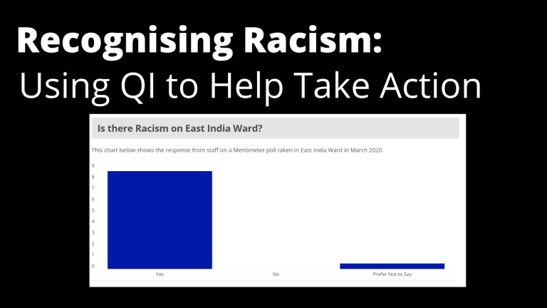
Recognising Racism: Using QI to Help Take Action
21st January 2021
-
QI Essentials: What does a Chief Quality Officer do?
18th March 2019

-
Using data enabled us to understand our problem
31st March 2023

-
Follow QI on social media
To keep up to date on the latest concerning QI at ELFT, follow us on our socials.