Home » Improvement Stories » Measurement for improvement – Generate your own run charts, quickly and easily
Measurement for improvement – Generate your own run charts, quickly and easily
16th January 2015
By Duncan Gilbert, Healthcare Governance Manager
In my last piece for the November newsletter I talked about measurement for improvement, and particularly the use of incident data in measuring safety, as one dimension of quality.
Since then the Trust has updated its incident reporting software, Datix, and now it’s never been easier to delve into the database and find the data you need, whether that is to set your baseline, measure improvement, help you start thinking about change ideas, or just indulge your curiosity.
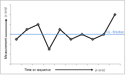
Having a look at incident data over time, in a run chart, is a great way to help you get started with a quality improvement project, either as a guide as to the sorts of issues or processes to start thinking about, or by quantifying, or confirming, what you think you already know.
Example of a run chart
We’ve now produced a simple step by step guide to generating your own run charts at ward, service or Directorate level, so it really couldn’t be easier to see what is happening in your service , and start generating ideas and small tests of change that could improve the service you are providing.
As you will see, the first step is to log in to Datix. If you don’t have a Datix account simply email datix.support@eastlondon.nhs.uk with ‘QI login’ in the subject box, stating the service that you are working in, and we will set one up for you within one working day.
Datix can provide a wealth of incident data, in a range of formats that can support your improvement work, and it is all easily accessible. If you want to find out more, have any questions, or need any assistance, then please don’t hesitate to contact me by email duncan.gilbert@eastlondon.nhs.uk.