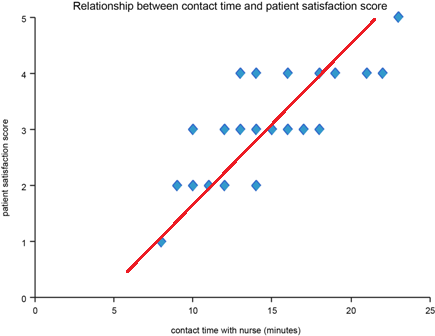
Scatter Plot
Overview
A scatter plot is a graph used to look for relationships between two variables
How to use it
Scatter plots show the relationship between the two variables in pairs of observations. One variable is plotted on the horizontal axis (usually the one that you are trying to control) and the other on the vertical axis (usually the one you expect to respond to the changes you are making).
If the vertical variable increases as the horizontal one does (as the example above shows) then we say there is a positive correlation. This may indicate cause and effect but it may not be that simple. If the vertical variable decreases as the horizontal one increases we say there is negative correlation. This may also suggest a cause and effect relationship for further investigation. If the dots are scattered all over the graph then there is no evidence for a relationship between the variables.
As with Pareto charts and frequency plots, separate scatter plots can helpfully be used to understand the difference between time periods with only random (common cause) variation and those with non-random (special cause) variation (identified using Shewhart control charts). Combining those time periods in a single scatter diagram may make interpretation more difficult.
Examples of scatter plots
The below charts show different relationships between variables, strong positive, strong negative
Follow QI on social media
To keep up to date on the latest concerning QI at ELFT, follow us on our socials.


