
Most Read Stories
-
Why is Quality Control important?
18th July 2018
-
An Illustrated Guide to Quality Improvement
20th May 2019
-
2016 QI Conference Poster Presentations
22nd March 2016
-
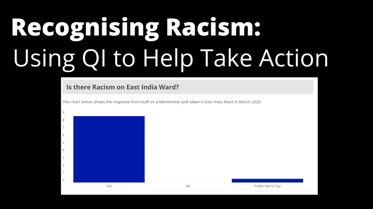
Recognising Racism: Using QI to Help Take Action
21st January 2021
-
Using data enabled us to understand our problem
31st March 2023

-
QI Essentials: What does a Chief Quality Officer do?
18th March 2019


Follow QI on social media
To keep up to date on the latest concerning QI at ELFT, follow us on our socials.